
People get hung up on how to format their blog posts for their photography site properly when really it’s not that difficult if you follow a few simple rules. As a photographer, you will have excellent visual ability anyway which helps towards seeing a good or a bad post layout.
It’s vital that you format your photography blog post to give your user the best experience possible. There are a few simple guidelines that you can follow that will improve the look and flow of your blog posts and web pages. These are quick to learn and I’ve gone through them below so that you can implement them on your photography blogs and websites.
There are several elements of how to format your blog posts whether they are related to photography or not. However, there are some extra things you need to think about being a photographer.
Why It’s Important To Format Your Blog Post?
One of the top concerns of the search engines especially Google is the person’s experience when they visit your website.
So why is that important when it comes to formatting use page or post?
The reasons it’s important is because a well-formatted post makes it easier for the reader to navigate and to read and in general, enjoy.
They will find the information easier, and they may stay on your page or post longer.
User experience does also affect your SEO ranking or rating. So doing your best to make sure your user has a good experience is one of the most vital things that you can do.
Below I have gone through and broken down each element of a standard blog post. There are however some things that will be slightly different that a photographer might post.
Your URL Link
With WordPress, your URL link, your link to your website post, is automatically created when you create your post and then changes when you create your title. You can if you want to change it.

As you can see from the example above all you need to be added is the page or post title in part or in full. Some people prefer to also have the date, but due to changes in Googles algorithms for evergreen content that lasts, it is fast becoming a thing of the past.
Short titles are best. If you look at the title here it is too long due to the overlong title of the site. However, the actual post title only has some of the elements of the post. Some people prefer to put the whole post name in, it is personal preference.
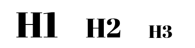
The Posts Main Title (H1)
In WordPress, your main title at the top of the page is H1 or heading one as a default. It is vital that you have a heading 1 even if you are not using WordPress as this is recognized as your main heading.
If you are expecting the search engines to pick up your post and rank it this title should not be obscure or difficult to understand. In fact, it should be clear anyway because again this is user experience they need to know what your post is about and your title does that.
For SEO your title should include your main key phrase concept heard in a case of this post how to format your blog post. As it’s specific to photography put that in too.
To get more readership, make it snappy if you can.
Format your blog post for better SEO or for your blog post for quality.
Titles are not really my thing I’m not very good at them. If like me you struggle with titles there are title analyzers on the internet that will help you improve your title structure.
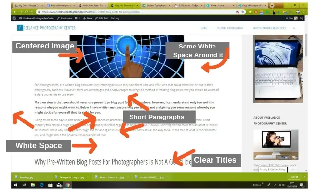
The Main Image, Format Size & Location
Next comes your main image. How you format this regarding size length and shape varies depending on the person’s preferences and your website style.
However, it’s vital to have a main image at the top of your post.
This image should be named and have alternate text at the background that reflects what your post is about.
Some people center their images as I do on my site. Others prefer to have an image to one side and have text down the other side. Although centered images seem more popular.
My view is that a large central image with a title above it looks cleaner.
The reason the image is landscape not portrait it’s because it also then fits into the featured image without having to change the structure which goes into the various lists on the website.
Some people prefer large portrait images. This is often because they use them on Pinterest and this is the preferred shape there.
Image Size for the Top Of Your Post!
Make sure that your Image fits the correct amount of pixels for the width of your page or just under. Allow that it can be enlarged or shrunk down. Do not put in a huge image as it takes up too much space. And do not put in a too small image as it pixelates. You’re talking images that are only KB and not MB and certainly not the size that DSLR take. JPEG is best.
Your Post Introduction
Next comes to the introduction. This needs to be 3 to 4 short paragraphs of about 3 4 lines.
The 2nd Title
Not everyone puts in a second title. It may not be necessary. It’s just a format that I prefer at the moment as it breaks away from the introduction.
Paragraph Structure, How to Make Successful Paragraphs.
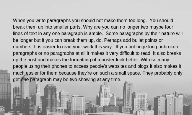
When you write paragraphs you should not make them too long. You should break them up into smaller parts.
Why are you can no longer two maybe four lines of text in any one paragraph is ample. Some paragraphs by their nature will be longer but if you can break them up, do.
Perhaps add bullet points or numbers.
It is easier to read your work this way. If you put huge long unbroken paragraphs or no paragraphs at all it makes it very difficult to read.
It also breaks up the post and makes the formatting of a poster look better.
With so many people using their phones to access people’s websites and blogs it also makes it much easier for them because they’re on such a small space. They probably only get one paragraph may be two showing at any time.
Sentence Length
I know this one because it’s a huge issue for me because of the way I speak and write. You need to keep your sentences fairly short rather than using link words like “and”. So if you look through your sentences when you finish writing them where you can break them up.
5 Reasons for Post Images
How you use your images will depend on their reason for being there.
- If you’re writing a how-to step by step post the images will often be there to be part of the learning process. They show somebody how to do something. So they’ll be sequential showing each stage of what you are telling them.
- As a photographer, you may also have posts where the image plays a more and central role in your post. Posts may be about a specific image or set of images for example.
- Images can and should also be used to break up your post and make it more visually appealing. The number of images you use will depend on what you’re writing and how long your post is and the images that you have available.
- To convey information.
- For social media sharing.
How To Format Your Image Size
Your images must be large enough to look good but not too large similar to the main image. You don’t want them slowing down your page load time. The more images you have obviously the more space it takes the more likely it is to do that.
You can condense images but it is easier to start a decent size.
Canva is a popular tool for this as it already has a lot of pre-format sizes for popular uses.
How Many Post Images Should You Have?
On a normal blog post, it is essential to have at least one image on your post. This is your main image at the top of the post.
In addition to this, you should have ideally another couple of images if you can.
How many images you have can depend on the length of the post and the type. A post that is mostly written rather than image heavy should be at least 1500 words long if they are a normal post with normal text to image ratio.
If you’re writing a step by step how to post the number of images should be a lot higher than this.
When you are doing an image gallery post than the images will likely outweigh the text in number.
You have to decide what’s right for you and your post. However, if you follow the guidelines here you should have enough images.
Post Titles/Subheadings
Unless you’re doing a list type post all of your posts should have internal post titles or subheadings. These break up the text. They make for easier reading. And easier for your visitor to find what they’re looking for.
What Headings Should Your Post Include
Your post should include your titles headings and subheadings.
Your main title has stated above should be H1. This comes as automatic in WordPress. Your main section titles should be H2 or heading to you can set these in WordPress by going to the top of the page and selecting them. If you’re writing in Google Cloud you can format this in advance and simply transfer your information to your post which will then take on your website look with all your formats still in place.
If you have subheadings beneath the main heading the subheading should be then Heading 3 or (H3).
The problem comes if you want to then do a sub, subheading. Search engines frown about the use of too many headings. This means you are only limited to 3 headings. Some people do this for but ideally, you shouldn’t.
The problem is that you’ve already used your title for your heading H1 so you really only got two to work with throughout the whole of the post.
Your options are to either use heading 4 or simply to either use uppercase or bolded text for that section.
The Use of Bold Italics and Underlining Helps…
Use either bold or italics and occasionally underlining your writing. This is another great way to highlight something that you want to say. It draws the eye and breaks up the text. You have to be careful with underlining this that usually classed as links.
Do not always in bold on just keywords though.
While it’s a great idea to use bold and italics do not do this too frequently as it negates its effect.
What is White Space?, How Do You Use it & Why You Can’t Ignore It?
What is White Space?
White space is the area between the writing on your post, whether it be above and below what are the sides. It is, in fact, the blank space between all of your writing, between or within your images and other graphics, even on your side columns. This space is called white space regardless of its actual color it can be pale blue for example.
How To Use White Space
White space is vital to the overall look of your blog and your blog post.
Why You Can’t Ignore White space?
White space helps make the overall look of the website cleaner, better and it is also easier to use a page or a blog where there is a good mix of writing images and white space. It also helps with your new website navigation.
It’s the same reason why we put in paragraphs. You do not want you to chunks of text to make it impossible for the person to read it. White space along with paragraphs subtitles and titles and images or help to break up the page making it flow better and easier to use.
It actually slows your visitor down and allows them to peruse your website at a more sedate pace which means that they enjoy using it more and taking more of what information is on that page.
White space could be a bit of a balancing act. You don’t want too little of it but you don’t want too much of it either.
By following the guidelines on this page and observing different websites you will have a better understanding of how to use white space and how you prefer to use it on your pages and website designs.
White space is also good for breaking up different areas of your page very much the same as title against as titles and paragraphs.
